Knight Frank’s Wealth Report | Creative Campaign
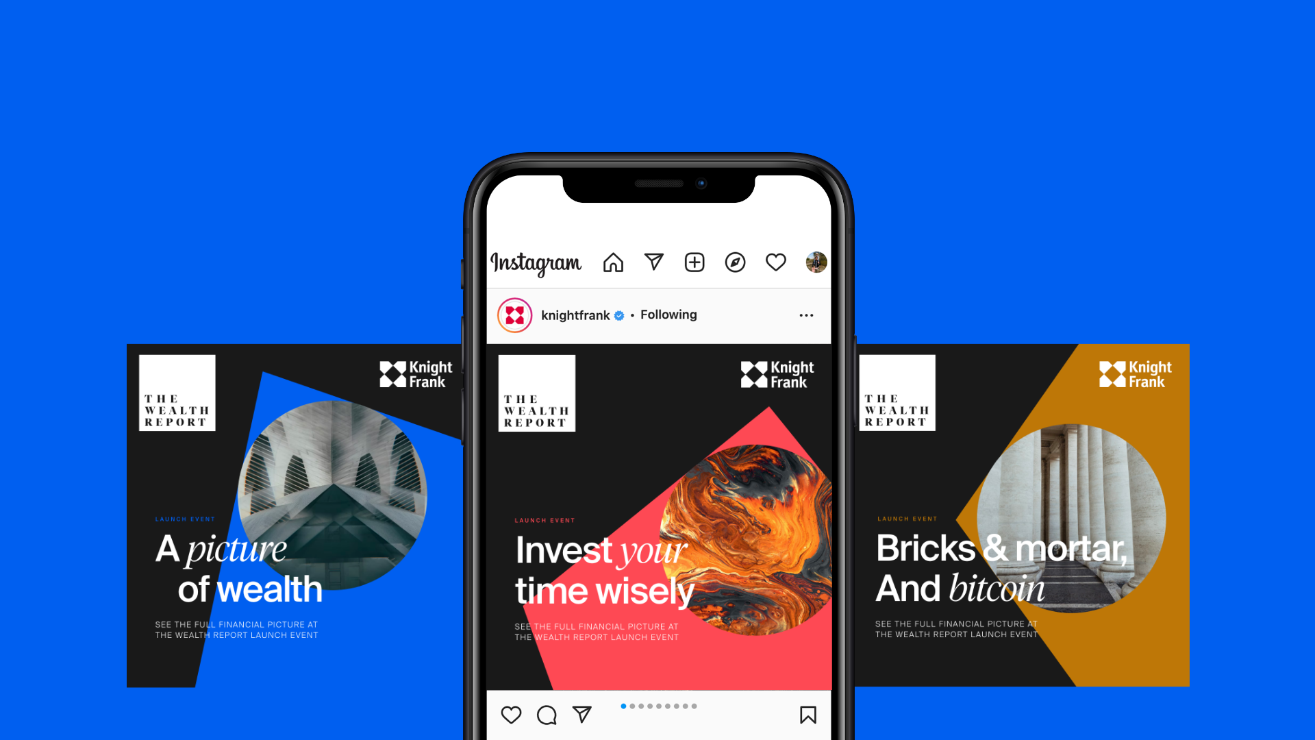
A picture
of wealth.
The brief.
Was to create the look-and-feel for its annual flagship publication, The Wealth Report, and its launch campaign.
Art direction | Brand Strategy | Digital Design
Art direction | Brand Strategy | Digital Design

The thinking.
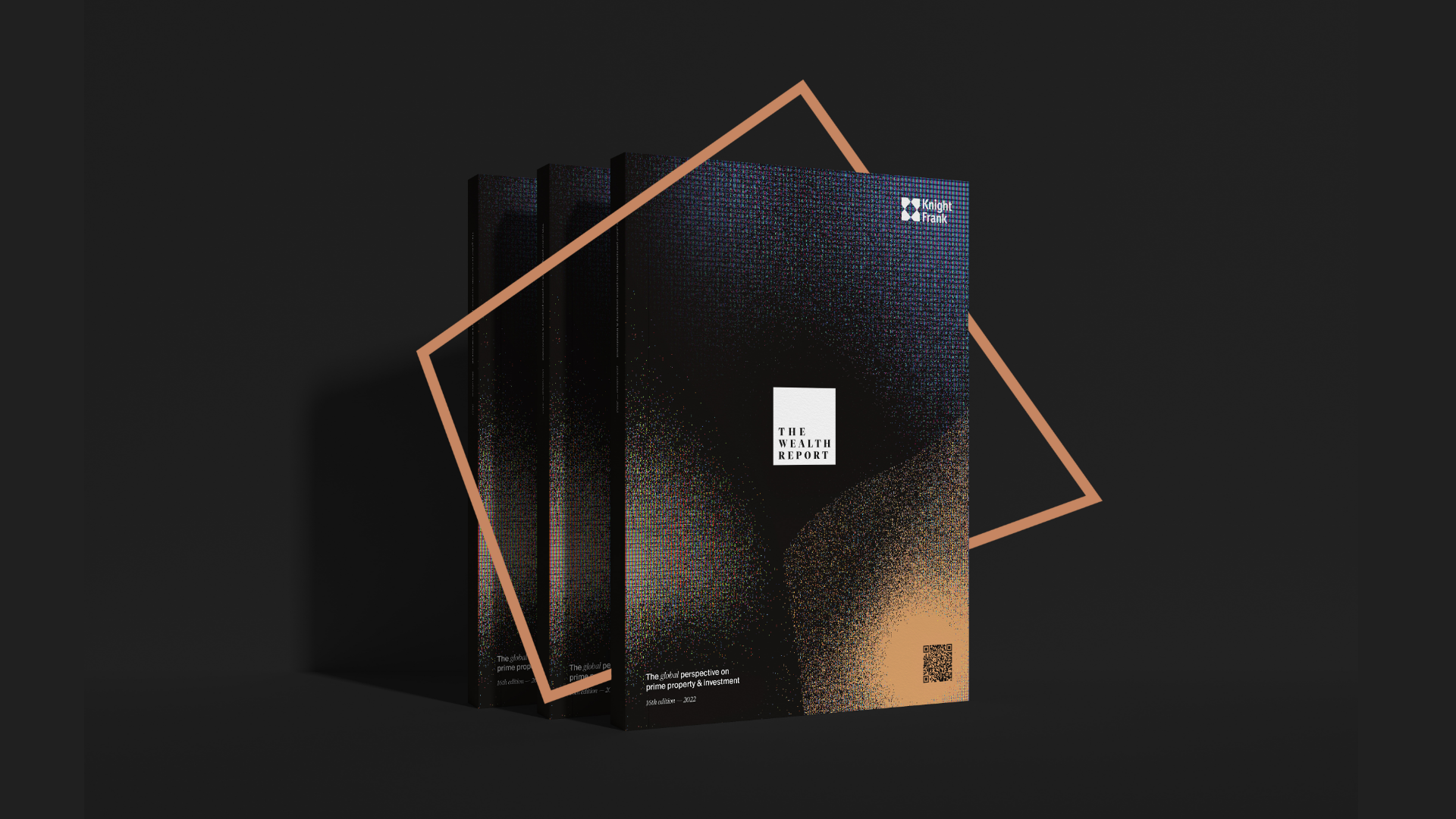
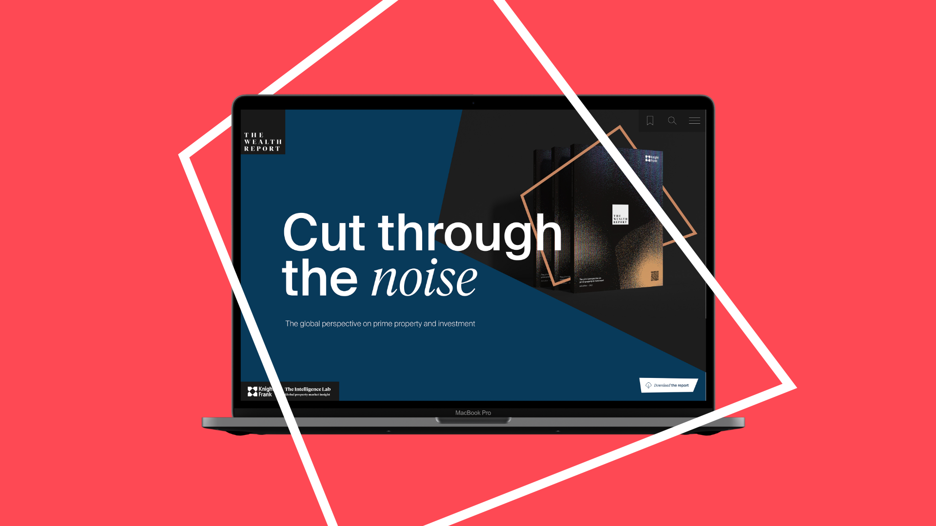
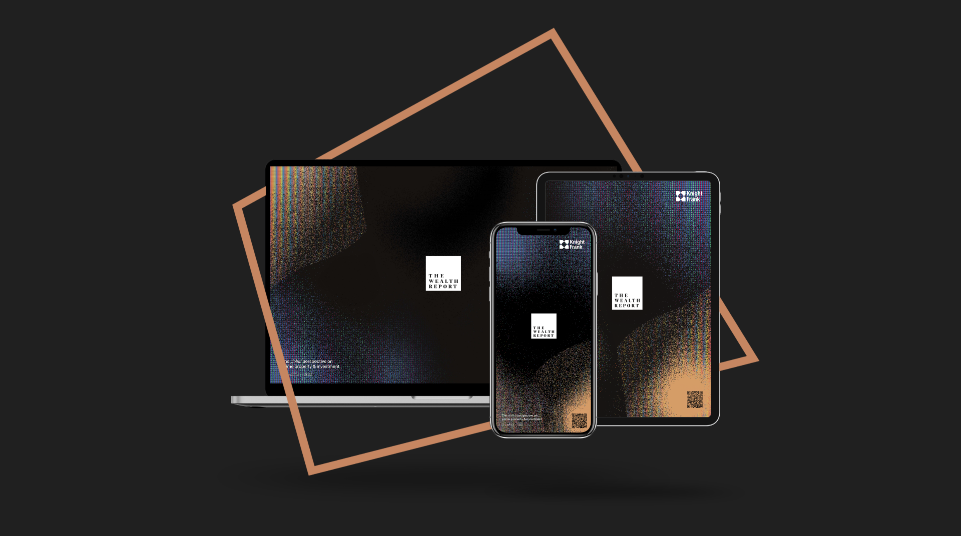
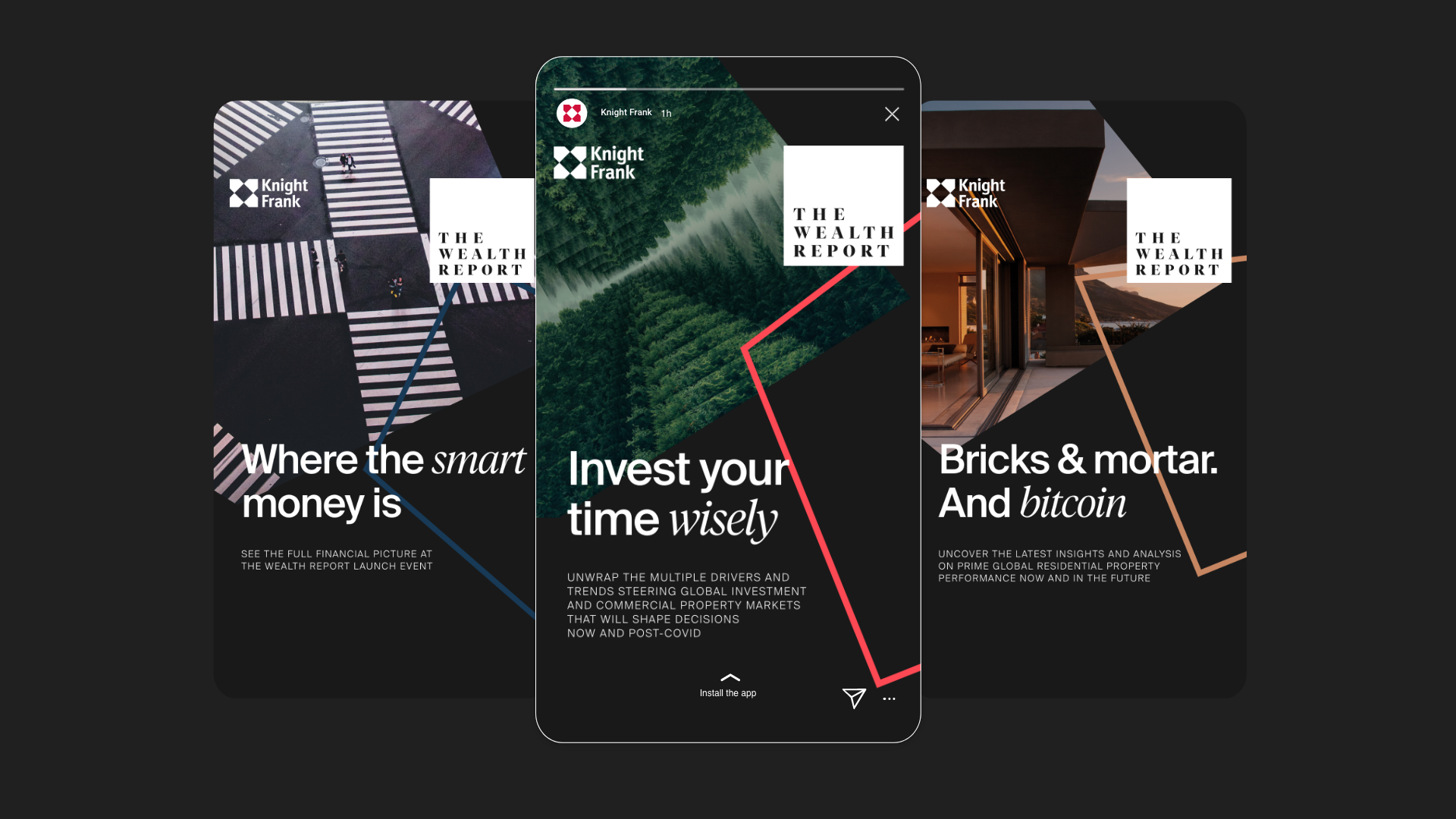
We wanted The Wealth Report to buck the confusing cultural zeitgeist caused by Brexit and COVID-19 and focus on providing clarity to its audience.
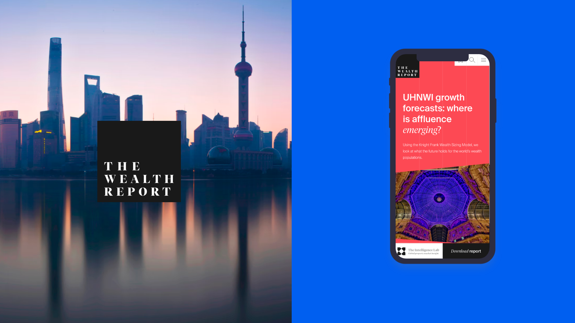
To symbolise this, we used the metaphor of a camera’s viewfinder, which zeroes in on what matters and zones out what doesn’t. We represented this viewfinder as simple squares, graphical devices and a QR code, taking readers directly to the report while cutting through the noise in the property sector with crystal clear insights and advice.

The result.
From first concept to final creation, our aim was to make a striking visual and verbal identity that held true to Knight Frank’s brand and values while pushing their creative to new heights.
The theme of cancelling out the noise has carried through the report, from chapter dividers to pull-quotes, making it easier to digest and helping readers — as per the campaign’s strapline — invest their time wisely.


Want your brand to shine?
If you liked what you saw above, click the button below